…but if you have to be negative, be smart about it
Sometimes you do need to say No.
Here’s a quick follow-up to my last post about negativity.
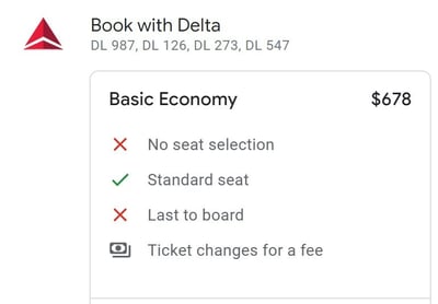
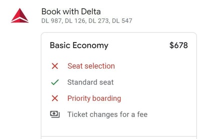
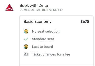
I recently booked a flight through Delta, and they’ve got this rundown of the perks that each type of ticket comes with. Here’s what I get with my cheap, standard, boring ticket:
Easy enough to understand at a glance, I suppose. But the first time I saw this, I thought the red X on the left was meant to negate the text it accompanies. So it’s saying No to “No seat selection,” implying I could select my seat.
As with the examples in my previous post, the user’s forced to parse a double negative, which can take a lot longer to process, and might even lead them to think the opposite of what’s true. I could see this being an intentional dark pattern, but then customers wouldn’t be as prone to upgrading.
This is particularly strange given the billions of tech startup landing pages with much more legible pricing tiers. Here are some examples:
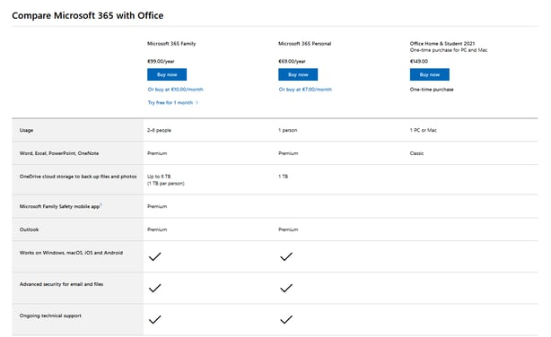
This Microsoft 365 rundown shows three pricing tiers, each with a number of features offered from each. All the Yes/No features are labeled in the affirmative (Works on Windows, Advanced security, etc), so the simple presence of a checkmark shows that feature is part of a given tier.
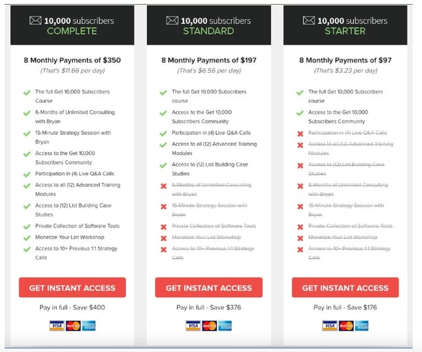
With this example from Growth Tools, you can still see the features that are provided with each tier. A red X shows what you’ll be missing out on, and a bonus strikethrough makes it even more obvious.
So I can see a couple ways to keep the same formatting in Delta’s rundown without the confusion: affirmative labeling, and more creative iconography.
Affirmative labeling would be pretty simple:
Instead of “No seat selection,” we say “Seat selection,” and let the X do the talking. To make it sound even more dire, I thought making the labels themselves red could be helpful.
But if we get creative with our icons…
…we can keep the negative labels, avoid the double-negative confusion, and let users know that this tier has a couple caveats that they might want to avoid by simply upgrading their ticket.
I’m sure I’ll come up with more examples to share about negativity in messaging, but I’ll try to focus just as much on positivity in UX writing. We all need more of that.
That’s all for today!